By Any Other Name - Part II
Painting a decorative smoothie long-tailed duck
You can follow Laurie J. McNeil and her teachings through her Facebook Page, http://Facebook.com/TheArtistryStudios. Offering private and group instruction, Laurie is available for speaking engagements and demonstration workshops across the USA and abroad. Contact Laurie for more information and to schedule your event, or to order a commission piece, by e-mailing Laurie@TheArtistry.com.
I used to struggle when I painted decorative smoothies. I find it much easier to paint decorative pieces. By the time I paint a decorative, I have already added the detail by carving, texturing, and wood burning. After that, all I have to do is put the correct color in the right place.
With a decorative smoothie, you use paint to create the feather detail on a three-dimensional canvas. You must paint in every feather and its detail, and contour them through shapes, quills, and the individual barbs. The way you make the barbs flow off the quills contributes greatly to a contoured look. You can create additional contouring with subtle shading and highlights.
For me, using an airbrush is like speaking a different language. I used the airbrush primarily for base-coat applications and for a couple of raptor palm fronds back in the 1990s. I stopped using it entirely in 2012 after I had a major breakthrough on a short-eared owl palm frond commission. This was when I began developing my own hand-painting process, one that gave me control over the painting, instead of letting the painting control me.
If you think painting is complex, I hope to change your mind. I break down my painting into manageable areas, which makes it less daunting. With each step I take, the bird comes more and more into focus. I start by blocking in base coats, and end by painting feather splits.
To see the part one of this article, on carving, click here.
Read the complete article in Wildfowl Carving Magazine's Spring 2016 issue.
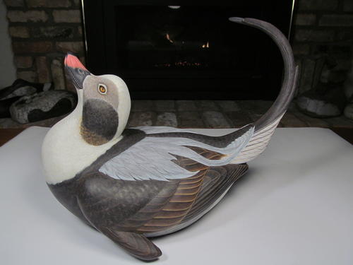
Painting a Long-Tailed Duck
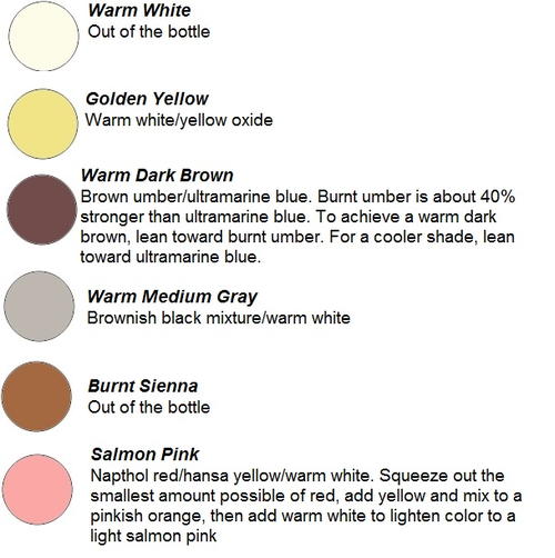
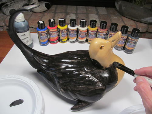
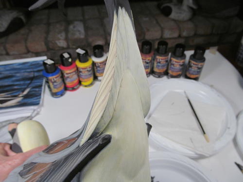
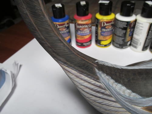
Decoart Traditions Acrylic Paints
Base Coat Colors Needed
Acrylic paint gets darker as it dries. Mix your colors a little lighter than you want them to be in the end.
Ultramarine blue, napthol red, hansa yellow, titanium white, warm white, yellow oxide, burnt sienna, burnt umber, carbon black, transparent yellow oxide, transparent red oxide
-
To determine the colors needed to block in the base coats, look at your reference (live birds in the field, videos or photos, or frozen or mounted specimens). Squint your eyes until the details of the bird vanish into areas of color. These are the base colors.
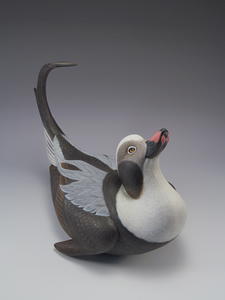
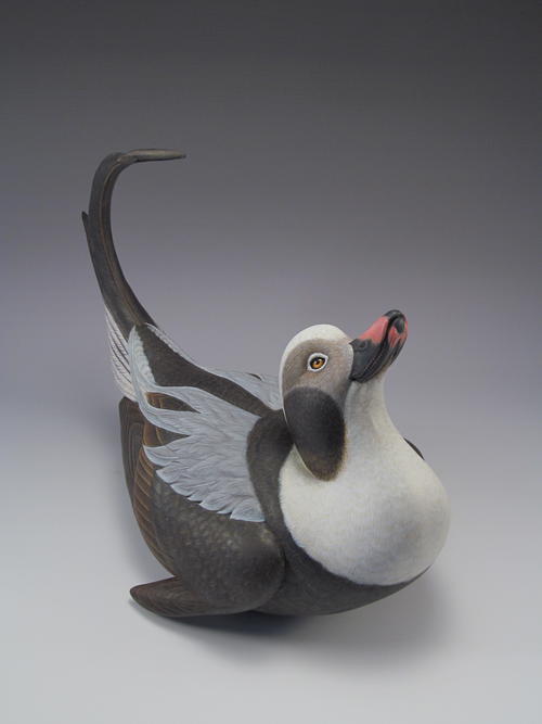
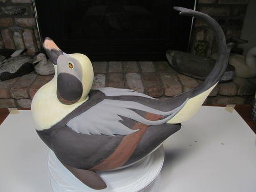
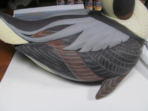
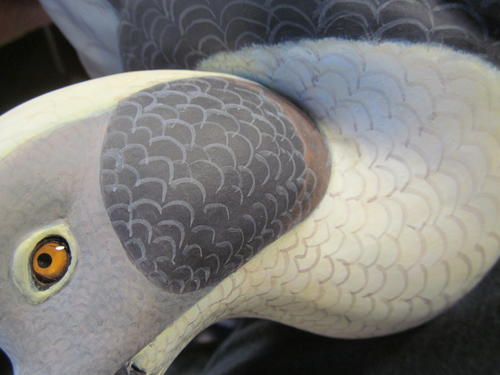
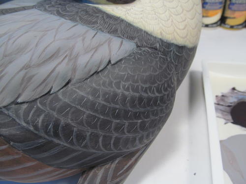
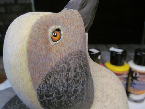
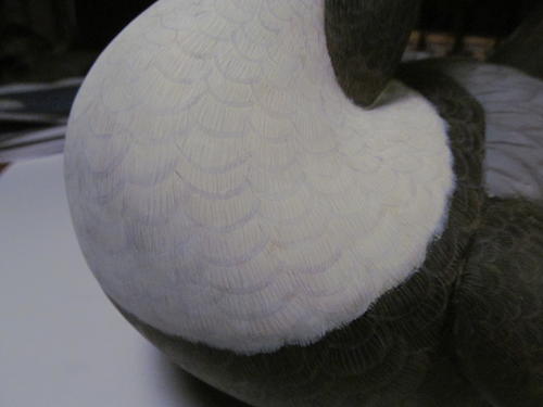
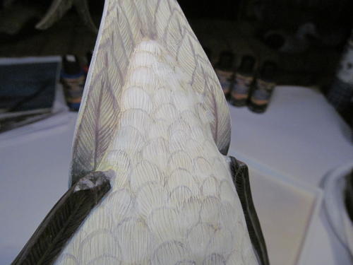
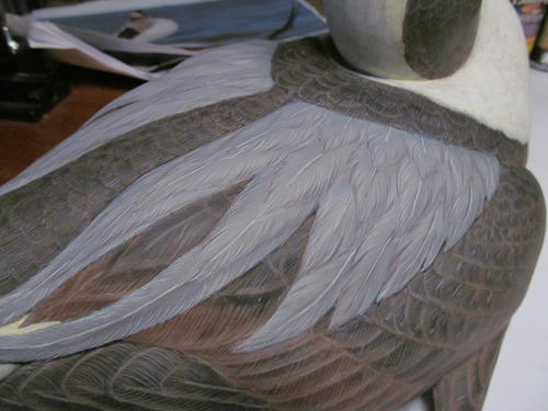
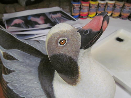
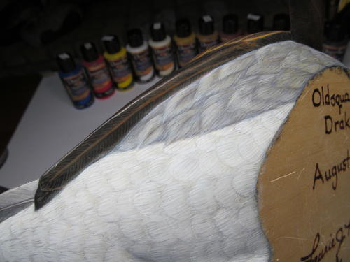
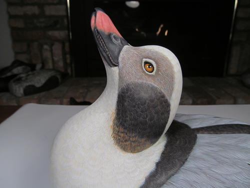
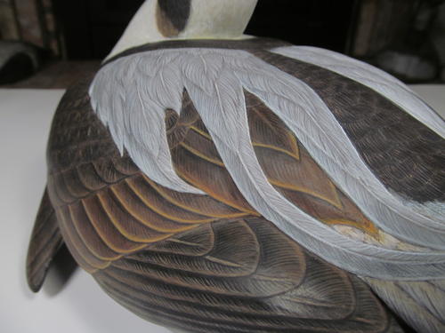
The base colors you see on the long-tailed drake are a white head and neck, gray face, and dark brown patch on the sides of the neck, with a smaller patch of chestnut toward the bottom. The scapular and side pocket groups and belly are gray, which extends down the flanks to the outer upper-tail coverts. The cape and back are dark brown, wrapping around the lower edges of the breast and extending down the back to the tail. Use the same dark brown for the major portions of the wings, fading into a burnt sienna on the tertial feather group. The lower-tail coverts, outer upper-tail coverts, leg and vent areas, and the outer feathers of the tail are white. The long central tail feathers and the bill are dark brown, with salmon pink on the upper and lower mandibles.
On this project I began to use a Masterson’s STA-WET Handy Palette. The STA-WET palette keeps the mixed paint wet for days without being watered down. This saves a ton of paint, and lessens the need to remix dried up paint, hoping to match it.
How to Paint a Long-Tailed Duck
Click on each image to enlarge it.
-
There are many good brands of polyurethane wood sealer. My preference is Deft Satin Finish in the quart can (not the spray can). I apply several coats with a 1" natural-bristle brush, watching carefully for drips and rouge brush bristles. You can smooth drips by dipping the brush into lacquer thinner and then brushing over the drip.
Seal the surface with three to four coats, then use fine (#0000) steel wool to smooth any surface anomalies. There should be no interruptions to the smooth surface (sealer drips, brush lines). It’s better to take care of that now rather than trying to make it look smooth with paint later.
In areas with fine detail or crevices, such as the bill hinge and eye corners, I use a soft brush to remove sealer dust and small fragments of steel wool. The steel wool can penetrate the polyurethane when you are smoothing the sealed surface. When this happens, the surface is slightly darkened and does not feel as smooth to the touch.
Apply subsequent coats of polyurethane and alternate with steel wool, until the surface is completely sealed and smooth. If left unsealed, these areas will develop a rough surface once you apply the water-based gesso primer. -
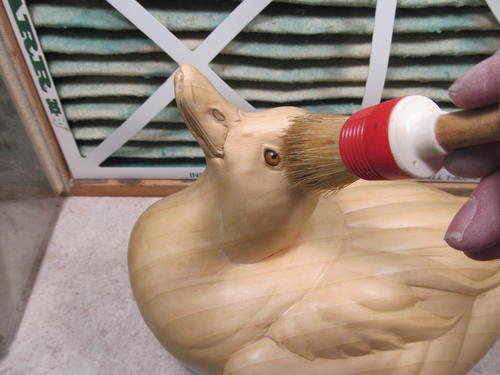
Liquitex Gesso is my preferred primer. I find it adheres well to the sealed surface, dries to a matte finish, and leaves no brush marks when thinned with a small amount of water. After several thin coats, the surface is one solid color, and will be slightly absorbent. Other brands of gesso seem very plastic-like in nature, and not absorbent. The one time I tried that type of gesso, it began peeling off the sealed surface within months. I use both white and black gesso, depending on the project. Starting from a solid black surface lends itself well to the long-tailed duck. I thin the gesso with water, to avoid brush marks. Use only enough water to make sure your brush strokes are not visible once the surface dries. If you add too much water, the gesso beads up on the sealed surface. It takes at least two to three coats to completely cover the surface so it is solid black, with no wood showing though.
-
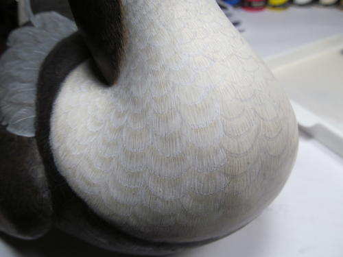
Before I base coat the bird, I look deep into the feathers of the real duck to see other colors that make up the whole. For example, the whites on the head of the real duck have a golden yellow tint at the base of the white feathers. I tint all the white feathers on the bird with the golden yellow, so warm white will show up in contrast. To create depth and perspective in a landscape, you paint the most distant object first, then work your way forward. The same principle is true when painting this three-dimensional canvas, but instead of distance, think about the depth of the feathers and the colors below the surface. There are colors there, and you need to include them. The combination of many colors makes up the whole. When applying base coats, several thin coats will always produce a softer look than one or two heavy coats. Apply as many thin coats as it takes to produce a solid color with no brush marks for your base coats. You could say the dark brown color is almost black, and you would be right, but you cannot paint carbon black on carbon black and have any detail show. The same principle holds true for titanium white. Using warm white and dark brown for the base coat lets you use titanium white and carbon black at the end for highlights and shadows. Painting white on white and black on black can be difficult. When I began using a contrasting color to lay in the individual feathers and feather details, painting became much easier, and I added a new dimension to my painting.
-
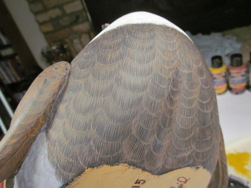
“A place for every feather, a feather for every place.” In a decorative smoothie, it is important to have a plan from the beginning. The individual feather lines I create in the initial feather layout are not the actual feathers. They are a guide, and in the end will serve as highlight or shadow, and not the outer edge of the feather itself. I will define the outer edge of each feather with many fine strokes before it is complete. Although there is no gray in the white breast, I use a warm gray to lay out my feathers. This will work as shadow. The individual feathers on the belly, back, wings, and tail are the same warm gray, even though there’s really no white in those feathers. The gray serves as a highlight. On this duck, I used a warm medium gray for the majority of the feather layout. It showed up as a dark gray on the white areas, and a light—almost white—gray on the dark areas. For the actual gray areas, I used a darker version of the same warm gray. It will appear in contrast on the gray scapulars and side pockets, and in the gray areas on the face. This makes the bird look more real, and it makes the painting easier. If you take the time to work out feather flow and number of feathers within a given area, you will have nothing to guess at later.
-
The lines that indicate the rows of wing feathers divide the wing into smaller areas, and help keep the feather layout straight. Later I will cover up these simple guidelines with individual barb strokes. Make sure the opposite side matches from all angles.
-
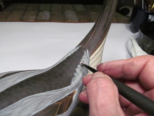
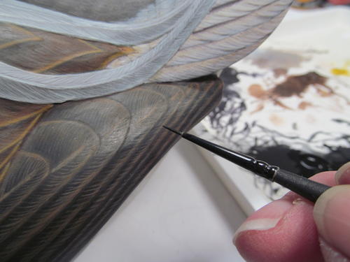
I use very thin paint to lay in feathers. DecoArt Traditions acrylic paint allows me to easily thin down the initial brush lines, modify and correct the feather shapes, or even remove the lines. A clean stiff brush dipped in clean water lets you remove and adjust the lines. The brush here is an old, worn-down badger-hair brush.
-
With these individual feather lines, perfection is not the goal. The important things are to get basic feather shape, count, and flow. These lines are the guides for laying in the fine feather detail, and will serve as highlight in the dark feathers.
-
With the same warm gray, I lay in the tail feathers. These lines will serve as guides and as shadows on the light tail feathers, as well as highlights on the dark central tail feathers. Make sure you get the right number of feathers, and that they flow out from the tail coverts at the correct angle.
-
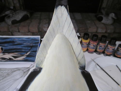
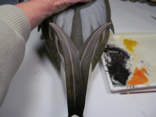
I left the tail and the bill thicker and sturdier than they are in reality. Painting will help them appear lifelike. I will match the feathers on the tail’s underside with those I laid out on the top. When you view the tail at a three-quarter angle, as in this photo, the feathers will appear carved.
-
Laying out the tail feathers correctly can be frustrating. If you spend time to get them right at this stage, it will make it much easier to paint the fine details later.
-
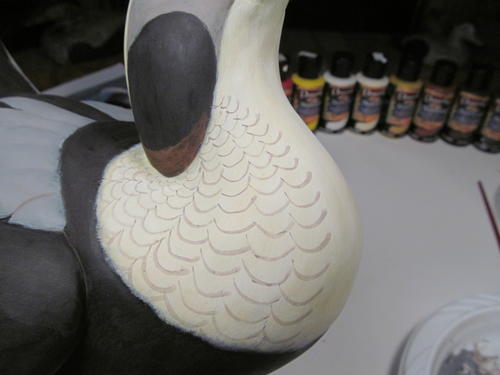
These feather lines break up the different feather groups into smaller areas. Pay attention to the direction of feather flow, with feathers gradually becoming larger as they flow down the head and neck into the breast.
-
With the same warm gray, I lay in the rump and lower-tail coverts. I use a darker gray to lay out the individual guide and shadow lines for the feathers on the gray side pockets and scapulars. Only the outer edges of the feathers are necessary now. Adjust as needed until you get them right.
-
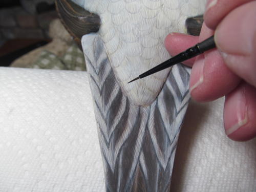
Once you’ve added the highlights and shadows for every individual feather, start laying in the visible quills. These provide an important guide to the layout and flow of the feather barbs. Not every feather shows its quill, so study your reference. Some quills are covered by other feathers, or are so fine they look like barbs. You can adjust a quill by using a clean, wet brush to softly scrub it away. I find it easier to just leave it and paint it correctly later, using the incorrect quill as a reference. Then you can remove the old quill lines.
-
This step adds highlights and shadow to the quills. I will correctly tint the contrasting gray color I used to lay in the quills after I have laid in the barbs.
-
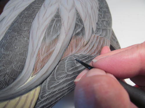
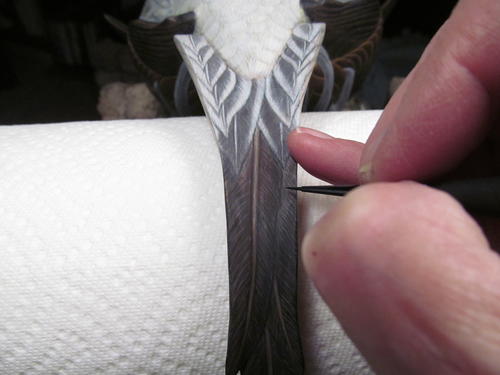
Lay in the barbs with the same procedure used for the quills. The subtle curves in the quills and barbs will define the contour or “loft” of the feathers. The outer edge of the feathers can be shaped using the clean, wet, stiff brush. It is rare to see a straight barb. It may have only a slight curve, but without it the barb will look flat and stiff. Don’t worry if a barb does not look perfect. The color you add later will cover up the imperfections. Consistency from side to side and in overall appearance is more important. Plan your painting so that when you stop, the bird is even from side to side. Don’t paint the right scapular group without painting the left in the same sitting. Otherwise it can be difficult to match everything from the brush strokes to the paint color.
-
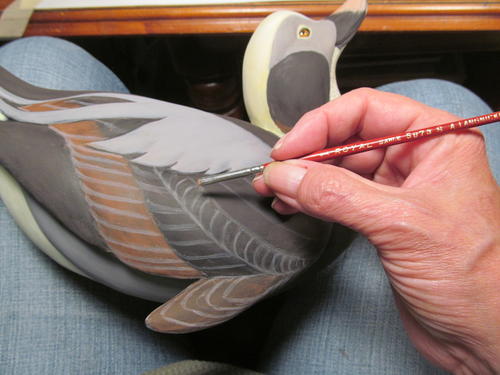
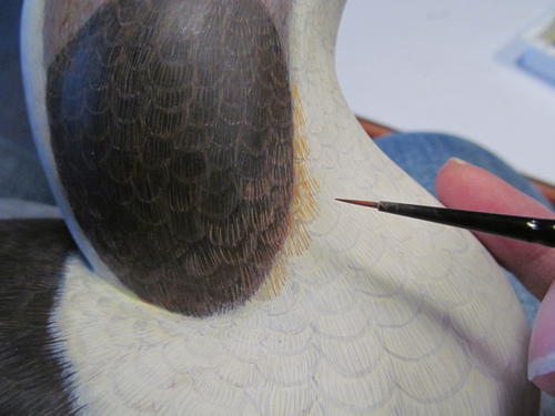
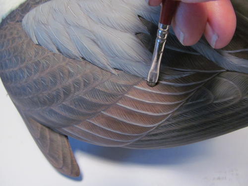
Add barb highlight strokes with warm gray to each of the individual feathers in the face’s gray area. You’ll want the paint at a consistency much like that of half-and- half. I use inexpensive ($2) Langnickel Royal Majestic Monogram (round) brushes in sizes 20/0 and 30/0 for fine barb detail. On the dark feathers of the neck patches, the warm gray looks more like white. After highlighting all the barbs, I come back with individual brush strokes, using very thinned-down burnt umber, burnt sienna, and yellow oxide in the dark neck patch. Using the light contrasting color in the barbs allows these new colors to show up on the dark feathers. This also provides a myriad of different colors to make up the whole.
-
With all of the highlights and shadows added for every feather quill and barb, it is time to start adding some color.
-
The face’s gray color includes dark and chestnut brown, dark gray, light gray, and white. I add individual barb strokes with yellow/orange (burnt sienna/yellow oxide). Another pass of burnt umber starts in the gray area and continues down into the neck patches. Then I go back to warm white to lighten the feathers where they meet the bill.
-
It is easy to adjust by using a few thin coats to brighten the whites. If you feel you have applied too much, you can come back with the clean, wet brush and adjust or even remove paint. You still want to be able to see the dark shadow lines, indicating the lower edges of the feathers, so you can come back with individual barb strokes to finish them.
-
On a long-tailed duck, the feathers on the top of the head are really quite long. Leaving the golden yellow undertone at the base of each feather will create depth and a more “lofty” appearance. I use a #8 filbert to brush warm white onto the outer edge of each feather. Subsequent brush strokes with the monogram detail brush and warm white will add individual feather barbs and lighten the outer edges.
-
Lighten the outer tail feathers with thin passes of white, softening the initial warm gray guidelines. These lines actually serve as shadow. Subsequent brush strokes of dark brown will add shadow, and warm white barb strokes will define the outer edge of each outer tail feather.
-
Treat the rump feathers the same way, applying warm white to the outer edges. Each application softens the feather. The quill shadow added to each tail feather will be warm gray. I will come back with the monogram detail brush and add the individual barb shadows.
-
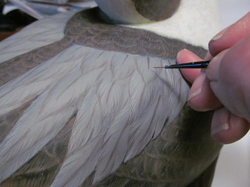
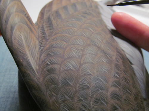
Using warm white and the fine detail brush, I begin to add individual barbs to each of the scapular feathers. I use my pinky as an axis for rotation and support. This lets me add very fine strokes with nice, natural curves. The angle of your strokes will determine how delicate your feathers look. Practicing on a paper plate will help you get a feel for the brush, how much paint you can load onto it, and how many strokes the brush will deliver. Paint consistency is very important! Too thin and it flows off too fast; too thick and it hardly comes off the brush at all, barely marking the surface. With some practice, you will figure out the number of good strokes you can get out of your brush, when you have the right consistency.
-
After the first pass of warm white on the outer edges, the scapular feathers look softer and more realistic. With warm white, I draw the first quill lines on top of the dark-gray guide line I painted earlier. I try to be consistent in thickness according to feather size, but I don’t obsess over it. I take a simple single stroke for the first pass on the quills. You can see how the dark gray becomes a shadow for the quill and barbs, giving each feather depth.
-
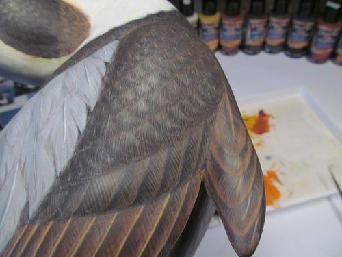
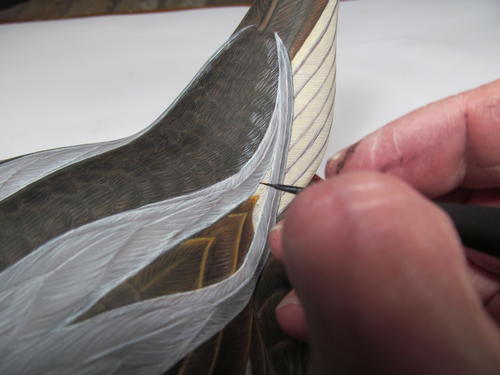
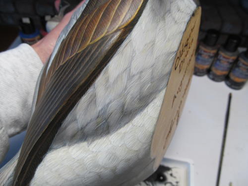
With the standard dark-brown mixture of burnt umber and ultramarine blue, I begin to refine the outer edges of the primary wing feathers. I start bringing these feathers into focus by cleaning them up.
-
I work on the top of the central tail feathers as they curve up and around. I use the clean, wet brush to adjust the quills’ curves and widths. With burnt umber, I tint the warm white highlights to the tops and bottoms of the feathers. I break up the thick barb highlights into the thin barbs, using the detail brush and the dark brown mixture first. Then I come back with carbon black on the outer edges of the feather barbs and quills.
-
The underside of the central tail feathers is lighter, especially toward the centers and the quills. Using dark brown, I add the outer edges of the barbs, leaving a lighter center along the quill area. Carbon black alongside the quill defines it and adjusts the width.
-
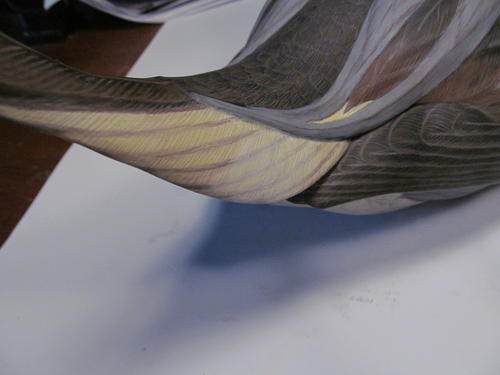
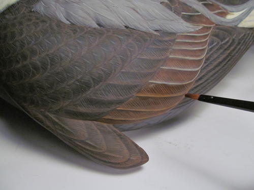
I add fine strokes to the smaller chestnut-colored patch with burnt sienna and yellow oxide, using the monogram detail brush. The warm gray below highlights these colors so they show up on the darker surface. I go back and forth between the burnt sienna, yellow oxide, dark brown, and warm white, adjusting the color to each patch. I slowly bring the patch to the right color, and feather out the color transitions with fine detail.
-
Once I complete the first pass of feather edging on the primary, secondary, and tertial feathers, I will define the rest of the wing feathers.
-
I define each of the dark wing feathers with dark brown. I will come back and paint individual barbs in the same color on the outer edge of each feather on my second pass.
-
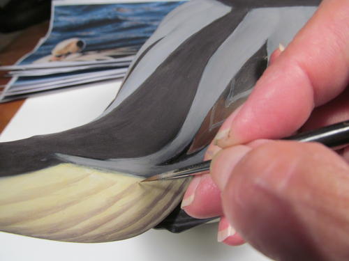
The secondary and tertial feathers have a distinct lighter, golden edge. I use very thin warm white to paint the outer edges as a highlight, and then I clean up and thin down the outer edging lines with a clean, wet, stiff brush.
-
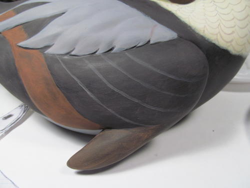
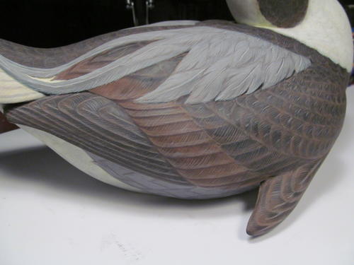
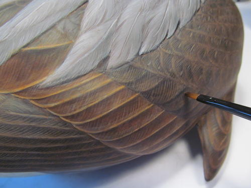
I use a small filbert to a wash a mixture of transparent red oxide and transparent yellow oxide over the secondary and tertial wing feathers. I will apply the same wash over all the dark feathers (cape, neck, breast, back, tail, primary, and alula). The warm-gray barb highlights I painted in earlier now begin to take on a nice warm glow.
-
I add further definition to the wing feathers with thin passes of carbon black. As the brush runs out of its paint load, it still delivers very subtle amounts over 5-10 strokes. This also applies with a detail brush on the quills. You will be amazed at how accurately you can paint quills using this method.
-
On the bird’s dark areas (breast, cape, back, wings), apply washes of burnt umber to tint and soften the warm-gray highlights added earlier. Doing this is much quicker than adding the color with individual strokes. You will paint in plenty in later passes. Just be sure the wash is thin and watery enough so it does not completely cover the detail. Let each pass dry before doing another.
-
Using my standard dark-brown mixture (burnt umber/ultramarine blue) and the same fine-detail brush, I feather out the outer edge of each feather with individual barb strokes. It is important to leave the bases of the feathers (close to the quill) light for contrast. The initial individual lines defining each feather have disappeared, and the warm-gray highlights of each barb stroke create depth and subtle color changes.
-
With the dark feathers all tinted, I begin to add the dark brown (burnt umber/ultramarine blue) by painting feather barbs on the outer edge of each feather. I come back for a second pass with carbon black. I will do the same on each individual dark feather with the detailing brush.
-
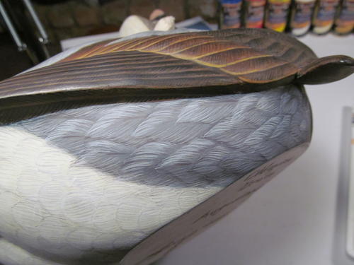
On the side pockets, I use warm white to add individual barbs to the outer edges of the feathers, for a slow subtle shading of each one. The top edges of the side-pocket feathers are lighter than the rest of the feather.
-
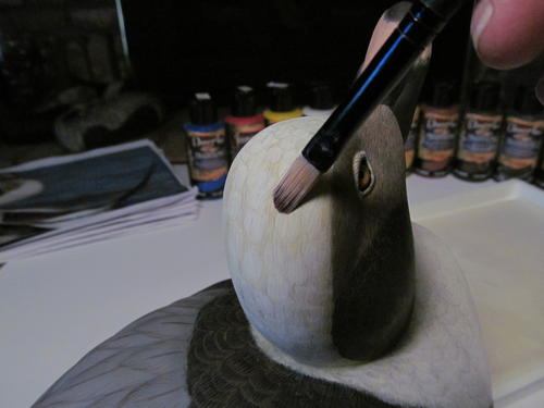
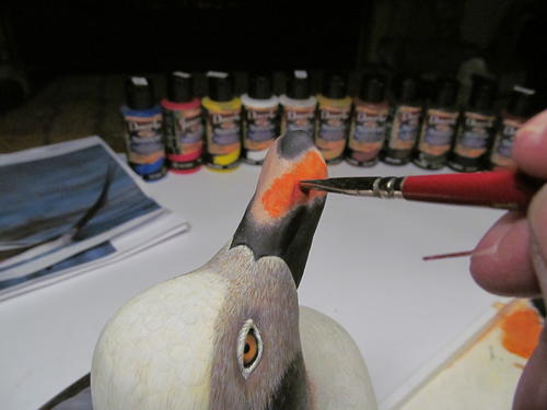
For the bill, I combine several colors. I look for the deepest color in the salmon area and see orange. The fleshy salmon pink I used for the base coat is a great support for the bright orange I will be use next. It’s a mix of hansa yellow, napthol red, and titanium white. I stipple on the bright orange with a short, dry, stiff brush. Stippling is a light pounding movement, with the brush perpendicular. This distributes the paint quite differently than brushing. You can get a soft edge with this technique, for a convincing color transition between colors. I use old, worn brushes for this process. Then I come back with a light, fleshy salmon using the same dry-brush stippling technique. The color will become more vibrant after I apply glazing medium.
-
I highlight the nostril with very thin warm white around the outer edge of the opening, then tint it with salmon. Using a clean, wet, stiff brush, I remove excess highlights and softly blend. I initially painted the lamellae with warm white, then tinted them with the salmon, using the monogram detail brush.
-
On the outer edge of the white breast and neck feathers, I add individual barbs with warm white, using the fine monogram detail brush. Leaving the base of the feather with the golden-yellow tint allows the warm white to show in contrast.
-
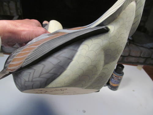
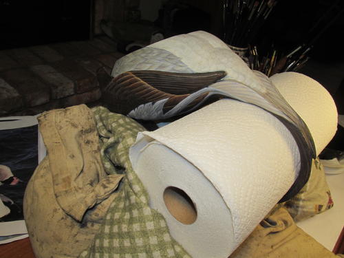
Painting the tail, especially the underside, was difficult. Holding the duck without resting it on the tip of the tail or the bill was nearly impossible. I ended up supporting the tail with a roll of paper towels that happened to be the right diameter. Then I used two sandbags to support a down-filled pillow sporting a flannel pillowcase. This set-up allowed me to work on the tail’s underside, hands free.
-
On the underside of the tail, I can clean up the individual feathers using a small filbert. Applying several thin passes of warm white lets me adjust the color. This also softens the warm gray feather guidelines and shadow I painted earlier. The centers of the light tail feathers have an ever-growing dark gray centers along the quills. After several coats, the feathers will begin to look cleaner and come into focus.
-
Until now, I had added the highlights for the long central tail feather with warm gray. Now it’s easier for me to paint the warm-gray barb highlights on these feathers. I will tint them with burnt umber, the same as the other dark feathers.
-
I further define the shape and length of each tail feather with dark gray and warm white. Adjust the dark gray area down the center of each feather with dark gray, and add more barb shadow lines with very thin dark gray.
-
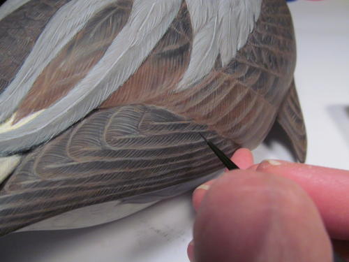
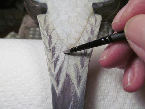
After tinting the central tail feathers with a few thin washes of burnt umber, I create a gradual color change by painting the barbs on the outer edge of each feather with dark brown. I leave the center of the feather, next to the quill, lighter for contrast. For the first time, I break out the carbon black. It’s a color best left for last, but I want to finish the majority of the tail’s underside while I have it supported. I use it on the outside edges of the quills to add definition and to thin down the width. Each central tail feather gets barbs added to the outer edges. This is also the time to paint the quills and barbs on the underside of the primaries, and the barbs on the rump and lower-tail coverts.
-
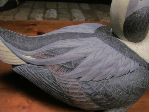
I add the lighter edges of the long gray scapular feathers with the detail brush. I have also added the initial white barbs of the upper-tail coverts.
-
Thin passes of warm white lighten the upper-tail covert feathers. I use the small filbert.
-
Thin carbon back separates the individual tail feathers as shadow, and I use warm white for the barbs on the outer edge of the tail feathers. Brushing many thin barb strokes softens the shadow lines I added earlier and adds depth. I use titanium white sparingly as highlights in the whites on the outer edge of the tail feathers.
-
I finalize the undersides of the wings with carbon black, and further define the side pocket feather barbs with warm white.
-
The feather’s darker center provides contrast for the quill. I add the quills with warm white and the monogram detail brush. Several strokes with very thin warm white along the quill lines add and refine the quill until it is clearly defined.
-
For the final definition of the dark feathers I use carbon black all over the bird. It really adds depth and makes the rest of the colors “pop.”
-
Beginning with warm white, I add individual barb strokes to the back edge of each white feather on the head. Titanium white at the very tip of each white head feather creates a highlight.
-
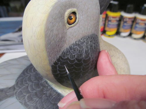
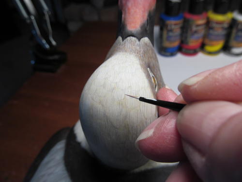
Using warm white, I adjust the gray color of the face around the bill and add overlapping barbs on the neck patches. I define the feather ring around the eye with dark brown and then brighten it with warm white. Finalize the salmon color of the bill with a dry brush pass of warm white to soften the color and transition to the bill’s dark areas. Once I am happy with the color and blending, a couple of coats of DecoArt Glazing Medium adds a nice sheen to the bill. It is also important to “in-line” the eyes with carbon black. This really makes the eye come alive. Cleaning the eyes is just as important. Use a wet wooden toothpick to completely clean off the surface of the glass eye.
-
Carbon black defines the dark feathers all over the bird, adding shadow to create depth. I also use it to paint the barbs on the outer edges of the dark feathers and along the sides of the quills, while titanium white highlights the outer edges of the scapular feathers and the top edges of the side pocket feathers. Further define the quills in both the scapular and side pockets with thin titanium white.
-
The amount of time you spend on your painting is entirely up to you. I could paint forever, trying to make it perfect, but at some point I have to decide it’s done. I reach that point when I can say I feel satisfied. This is the kind of thing that helps define one’s style. Even as you strive to improve, do not lose your own style. For many years I tried to carve and paint like other champion carvers. I was chasing their styles instead of embracing my own. Concentrating on what I knew about my own work and how I could improve it was the key. When I stopped trying to figure out how others achieved their styles, I truly began to achieve my own. When you find your style, embrace it.

Read NextHand-Made Kingfisher